
I’ve got ten solid ways to decorate your large living room wall.
Start by picking your approach—go bold with one statement art piece or create a gallery wall mixing multiple artworks.
Layer in floating shelves for storage, hang a mirror to amplify light, or paint an accent wall that ties your whole room together.
Add a console table below, install picture lights and sconces for visual interest, and pair everything with a complementary rug.
Each strategy builds on the last, creating depth and personality in your space.
[link-whisper-related-posts]Choose Your Approach: Single Focal Point or Full Wall Treatment

How do you want your wall to feel—like it’s showcasing one strong piece or displaying a carefully arranged collection?
Choosing between these approaches shapes your entire room’s personality. If you’re drawn to simplicity, go with a single focal point: hang one or two large artwork pieces or mount a large TV as your wall’s centerpiece. Pair it with a bold rug underneath to tie everything together.
Prefer more visual interest? A full-wall treatment might be your answer. Consider a gallery wall with matching frames or a continuous wall mural that fills the space with coordinated pieces. The key is deciding what works for you. Your wall should communicate how you want guests to experience your living room—whether that’s calm and focused or dynamic and engaging.
Hang a Statement Art Piece as Your Wall’s Hero

Why settle for a blank canvas when one bold, color-rich artwork can change your entire living room?
I’ve learned that a statement piece becomes your room’s anchor—the thing everyone notices first. Here’s how I’d approach it:
- Select a large-scale piece that commands attention and matches your wall’s width
- Pull furniture away from walls to create depth and prevent that flat, boring look
- Pair it with a complementary rug that echoes the artwork’s colors and grounds your space
- Keep surrounding areas minimal so nothing competes for attention
At eye level with high ceilings, this piece tells your story. I’d pair a vibrant abstract with warm neutrals, or a bold portrait with jewel tones. The result? Your living room becomes deliberate, unified, and distinctly yours. That’s what choosing one hero piece accomplishes.
Create a Gallery Wall to Mix Multiple Artworks

If you’re ready to move beyond a single focal point, a gallery wall lets you showcase your whole collection while building visual interest across that large expanse. I’ll walk you through planning your layout (yes, tape on the wall first), selecting pieces that work together even when they’re different, and getting them hung at just the right heights so everything looks purposeful rather than random. By mixing frame styles, artwork mediums, and sizes around a central anchor piece, you’ll create a dynamic display that tells your story without feeling too matchy or predictable.
Planning Your Gallery Layout
Once you’ve gathered your artwork, the real work begins when you figure out how to arrange it all. I’ve learned that planning your gallery wall layout before hammering any nails saves frustration and produces strong results.
Here’s my approach:
- Test on the floor first – Lay out all pieces on your floor using painter’s tape or paper cutouts to visualize spacing
- Choose a central anchor – Select your largest or most prominent piece as your focal point
- Consider sightlines – Arrange pieces at eye level from your favorite seating spot for maximum impact
- Vary heights and shapes – Mix vertical and horizontal orientations to avoid rigid symmetry and achieve modern balance
This deliberate planning ensures your gallery wall becomes a well-organized display that appears naturally arranged rather than randomly assembled.
Selecting and Mixing Artwork
The beauty of a gallery wall lies in how you can curate it—you’re not locked into matching frames or a single style, and honestly, that’s what makes the whole project interesting. You can mix mediums, colors, and sizes to create something that’s yours. I recommend finding a unifying thread—maybe a consistent color palette or framing style—that ties everything together without feeling forced.
Alternate between large statement pieces and smaller supporting works. This balance prevents your gallery wall from looking chaotic while filling that intimidating space. Think of it like a conversation: bold prints start talking, then smaller pieces chime in thoughtfully.
Before you commit to anything permanent, lay everything on the floor first. Arrange and rearrange until it works. You’ll figure out what actually suits your room.
Hanging and Arranging Pieces
Now that you’ve curated your pieces and arranged them on the floor, it’s time to actually get them on the wall—and this is where good planning saves you from a wall full of nail holes.
I’ve learned that a gallery wall thrives on deliberate spacing and balance. Here’s my approach:
- Use a level and measuring tape to mark your central focal point first
- Work outward symmetrically, maintaining 2-3 inches between frames for visual cohesion
- Consider installing a wall rail system for flexible repositioning without damage
- Step back frequently to check sightlines from your seating areas
This method creates an organized, professional-looking display. You’re building a central element that shows your taste while keeping visual harmony throughout your space. Follow through with the process—your gallery wall will anchor the entire room.
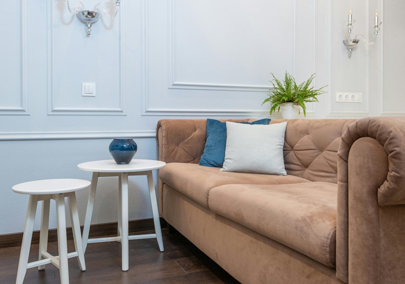
Build Floating Shelves to Layer Storage and Display

How do you turn a blank wall into a stylish gallery without committing to permanent fixtures? Floating shelves are your answer. I’ve found they’re an effective solution for refreshing my space constantly. You can arrange them flanking your fireplace or television, creating visual balance that grounds the room.
What I love most? Swapping art, books, and decor without drilling endless holes. Install shelves at varying heights—floor-to-ceiling works wonderfully—and you’ll layer storage with display space effectively. Mix books, potted plants, framed photos, and keepsakes to maintain visual interest. The key is avoiding clutter by rotating items seasonally.
Floating shelves change how we style large walls. They’re affordable, flexible, and straightforward to install. You’re joining countless people who’ve discovered this practical approach to wall design.
Add a Large Mirror to Bounce Light and Space

One strategically placed mirror can absolutely change how your large living room feels—and I’m talking about the kind of change you’ll notice right away. Here’s what works best:
- Position a tall mirror flush against your wall to balance scale with bold art or a TV
- Choose frame styles ranging from vintage to modern that suit your room’s vibe
- Pair your statement mirror with textured or minimal backdrops to avoid visual overload
- Install secure mounting hardware, especially anti-tip systems for high-traffic areas
When you bounce natural light around your space, your room feels bigger and brighter. Mirrors serve as visual anchors while doing practical work. You’re not just decorating—you’re actually expanding how your living room functions and feels.
Frame Your Wall With Shiplap or Molding for Texture

Want to create a blank wall with real architectural character? Shiplap or molding provides depth and visual interest. When you install shiplap horizontally, it widens the wall and gives your space that cozy feel. Vertical board-and-batten details draw the eye upward, which works well for balancing tall ceilings. You can also use molding to create panel sections or add a picture rail for flexible gallery displays. The key? Coordinate your finish with existing wood tones so your shiplap complements rather than competes. This approach lets your art and furniture stand out while adding genuine architectural bones to your room. It’s like giving your wall a confident foundation.
Paint an Accent Wall That Ties Your Palette Together

I’ve found that choosing an accent wall color is one of the best ways to pull your whole room together—it’s like finding that perfect piece that makes everything else click into place. You’ll want to pick a shade that echoes your existing rug, furniture, and art instead of fighting against them, whether that’s a soft dusty-rose for a unified look or a bold azure that pops against white walls. The trick is selecting your major pieces first (think sofa, rug, and artwork), then painting the accent wall last so the color actually enhances your setup rather than working against it.
Color Selection and Inspiration
How do you pick the perfect accent wall color when your living room has a lot of space to fill? I’ve learned that the best approach starts with what you already love in your room.
Here’s how I narrow down my choices:
- Look at existing pieces – Check your rug, curtains, and artwork for color inspiration
- Test tone-on-tone options – Try dusty rose with pale pink for subtle depth
- Consider bold contrasts – Bright azure or olive green create visual interest against white walls
- Observe lighting changes – Watch your swatches throughout the day under natural and artificial light
The trick is letting your accent wall become the visual anchor that ties everything together. When you coordinate thoughtfully, your living room feels complete and welcoming—like it was always designed this way.
Implementation and Design Balance
Once you’ve picked your color, it’s time to actually paint. An accent wall works best when it coordinates with your rug, curtains, and artwork. This creates visual harmony throughout your space. Start by prepping your wall carefully: tape edges, lay down drop cloths, and use quality paint and a roller for smooth coverage. Apply two coats for depth and richness. The benefit of this approach? You’re not committing forever. Paint’s flexible—if your preferences shift, you can update it easily. Watch how your accent wall ties everything together, pulling your room’s colors into one cohesive story. The result is a living room that demonstrates clear design choices and careful attention to detail.
Layer a Console Table Below Your Main Feature

Why does layering matter when you’re tackling a massive wall? Because a console table turns that empty space into something with purpose and appeal. I’ve found that placing a console directly beneath your feature creates a strong anchor point for your room.
Here’s what makes this work:
- Position a console table at the right depth and height so it complements rather than competes with your wall
- Add matching end tables with lamps on either side to frame your seating and balance the lighting
- Style the console with a bold art piece or curated collection that echoes your wall’s colors
- Hang a mirror above to reflect light and add perceived depth to that large wall
You’re not just filling space—you’re creating a connected design that ties everything together well.
Use Wall Sconces and Picture Lights to Highlight Your Design

I’ve found that layered lighting makes a large wall more visually interesting, and here’s why: you’ll want to combine picture lights mounted directly above artwork with wall sconces positioned on either side to create depth and direct attention exactly where you want it. The key is balancing brightness so one focused fixture doesn’t wash everything out, which means thinking about how many watts you actually need (usually 40-60 for picture lights) and spacing sconces about 60-70 inches apart. Once you nail this placement strategy, whether you go hardwired for that clean look or plug-in options for flexibility, you’ll create a museum-quality mood that makes your wall display the focal point of the room.
Layered Lighting for Impact
How’d you like to turn your large wall into something that looks like it belongs in a gallery?
Layered lighting creates that museum-quality feel I’m talking about. You’ll want to combine multiple light sources strategically:
- Position a picture light directly above your focal artwork to enhance visibility and draw the eye there
- Install hardwired sconces on either side for balanced, even illumination across your entire wall
- Mix in plug-in options to avoid messy cords cluttering your space
- Choose longer-arm fixtures that amplify your wall’s vertical height beautifully
The trick is avoiding glare on glossy surfaces while keeping everything evenly lit. When you layer these elements thoughtfully, your wall becomes a real centerpiece. Suddenly, that blank expanse becomes an intentional design statement. You’re not just decorating—you’re building your own personal gallery experience at home.
Sconce Placement and Positioning
Now that you’ve got your layered lighting plan locked in, let’s talk about where to actually place those sconces and picture lights—because positioning affects the difference between a well-lit wall and one that looks professionally designed.
Mount picture lights directly above your focal artwork to create that museum-quality feel. For wall lighting, position sconces symmetrically on either side of your piece—this frames everything nicely and adds balanced glow. The key? Angle them to avoid glare on glass surfaces, centering the light beam on your artwork’s center.
Consider hardwired sconces for that clean, permanent look, though plug-in versions work well if you’re skipping electrical work. Here’s the best approach: dim those sconces to highlight textures and set mood without overwhelming your space. Your seating area should feel comfortable, not like you’re under interrogation.
Pair a Bold Rug With Your Wall Feature for Balance

Why does pairing a bold rug with your wall feature feel like suddenly everything clicks into place? I’ve discovered that combining these two elements works well in your living room. Here’s how to make it work:
- Echo your wall feature’s color palette in the rug to reinforce cohesion
- Position the rug in the room’s center to anchor the space visually
- Choose neutral curtains and textiles to prevent competing focal points
- Add a low console or shelving beneath both pieces for grounding storage
When I paired a vibrant abstract painting with a coordinating area rug, the whole room came together. The rug pulled the wall feature down into the space, creating depth rather than flatness. You’re not just decorating—you’re orchestrating a conversation between your walls and floor that invites people in.